reader comments
286
with 196 posters participating
Share this story
Share on Facebook
Share on Twitter
Share on Reddit
We traded the thing on the left for the thing on the right. And yes the display really looks that bad in real life.
The back has a grid texture, once of the few luxuries on a $10 phone.
The top houses the earpiece and sensor cluster. There's no front facing camera, though.
The bottom houses painted-on navigation buttons that don't light up.
The back is removable, and there's a MicroSD slot! It even comes with a 4GB card in addition to the 4GB of on-board storage.
Along the top is just a headphone jack.
Volume and power are where you would expect them to be.
Also on the back is the speaker.
MicroUSB 2.0 is along the bottom edge, along with a single microphone.
The Sunrise is pretty thick. Here it is next to the Nexus 5X.
It's also very small.
The darkest the screen gets is only ever a grey color.
The other day we were rather shocked to hear that Walmart was selling a pre-paid smartphone for
ten whole dollars
. When we saw the device was running Android, we just had to see what it was like. So we walked into our local store, plunked an entire $10 bill down on the table, and walked out with a rough facsimile of a smartphone. Meet the LG Sunrise.
This is not our first trip into the masochistic world of ultra-cheap smartphones. We previously reviewed the
Intex Cloud FX
, a $35 smartphone that ran Firefox OS. The Cloud FX had a ton of problems, but for us the most limiting thing was FireFox OS. It couldn't run any benchmarks or our battery tests, making the device a $35 slab of uselessness that could occasionally render a webpage without crashing. The Sunrise is packing something much more familiar though: Android. It's only running Android 4.4 KitKat, but that's a lot better than Mozilla's app-less browser OS.
We should mention that while we walked into a Walmart and spent only $10 on this device, it was on sale. Various carrier models have the MSRP of the Sunrise listed for $40-$60. We should also mention that this $10 deal is for a locked prepaid phone. If you want to have cell service on this device, it has to be with
TracFone
unless you want to unlock it somehow. You could also just never get service and have a $10 Wi-Fi device.
The specs look like
something out of 2007
: a 3.8-inch 480×320 display, a dual core, 1.2GHz Snapdragon 200, 512MB of RAM, 4GB of storage, and a 3MP camera. Everything here aims to fits the most basic
definition
of each component rather than living up to any kind of performance standard. The camera, for instance,
technically
records some kind of image based on the light that enters the lens, but we wouldn't call that image "good." The display is a grid of squares that can change colors to represent text or images. There is even a speaker that can create several different noises.
But hey, it's $10! You've got to lower your standards appropriately. If your other option is nothing, there is actually a lot the Sunrise can offer: It can boot and show the Android desktop. If you tap the screen, something (eventually) happens. You can load up Chrome and browse the Internet. You can run apps—even the Google apps—and have access to the entire Play Store. You'll get Google Maps, push notifications, voice commands, and everything else you would expect. It's pretty amazing that for the cost of two Starbucks drinks you can get a mostly-functional, Internet-enabled smartphone that can (more or less) run the same software as a $600 flagship.
Advertisement
Design and Build Quality
SPECS AT A GLANCE: LG Sunrise L15G
SCREEN
480×320 3.8" (152ppi) LCD
OS
Android 4.4 KitKat
CPU
1.2GHz dual-core Qualcomm Snapdragon 200
RAM
512 MB
GPU
Adreno 302

STORAGE
4GB plus MicroSD slot (1.15GB usable)
NETWORKING
802.11b/g/n, Bluetooth 4.0, GPS
PORTS
MicroUSB 2.0, 3.5mm headphone jack
CAMERA
3MP rear camera
SIZE
113 x 63.5 x 12.44 mm (4.43 x 2.50 x 0.49 inches)
WEIGHT
119 g (4.20 oz.)
BATTERY
1540 mAh (removable)
STARTING PRICE
$10
OTHER PERKS
A 4GB MicroSD card!
Is a $10 smartphone really ever "designed?" Sure, it is constructed to meet some kind of specification, but "design" feels like we're overstating things a bit. The 3.8-inch screen means the Sunrise is tiny by 2015's standards. It's like two-thirds the size of a normal smartphone. It's also pretty fat at over 12mm thick.
The materials here, are, of course, as cheap as possible. The exterior shell is made from a matte plastic, although LG was nice enough to include a grid pattern rather than plain plastic. The touch panel is plastic too, which makes it easy to scratch. The phone also lacks the rigidity we're used to from Gorilla Glass panels. Push with a bit of force and you can deform the touch panel enough to smoosh the liquid crystal display and distort the image around your finger.
The touchscreen and display aren't bonded into a single sheet, leaving a noticeable air gap between the two layers of the device. Most modern smartphone displays look like they sit at the top of the device, but this is definitely sunken into the body a good amount. Less light comes out as a result, making the screen dim and washed out.
The display is easily the worst part of the Sunrise, and if we were d
esigning a higher-budget version of this, the display is the first place we would spend more money. The 3.8-inch, 480×320 is very grainy, and with Android and LG's skin optimized for higher-resolution devices, text can often be difficult and unpleasant to read.The viewing angles are absolutely awful. At a straight-on 90 degrees the screen looks OK, but tilt a few degrees in any direction and the screen will change to either a hazy white or go completely negative with inverted colors. The viewing angles are so exact that just normally holding the device creates a "shimmering" effect, where the slight changes in angles makes the colors fluctuate.
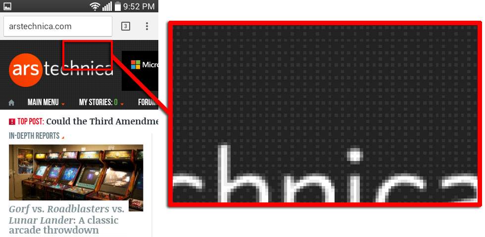
Dithering in action on the LG Sunrise awful display. The dark background should be a solid color, but it isn't.
Ron Amadeo
Any modern display you use today has 16 million colors, but the Sunrise LCD can only display 65,000 colors. To make up for the missing 15.9 million colors, the display uses "dithering" where instead of a solid color, it tries to "mix" colors together by displaying a pattern of the closest two colors it can show. For instance the background of the dark arstechnica.com site isn't pure black—it's something the Sunrise can't quite display—so it makes the background grey and overlays a grid of black dots onto it. This happens on most colors and makes the already grainy display look even grainier.
The display hurts every single activity you can do on this device. It can load webpages, but reading text on the grainy screen is unpleasant. It can play YouTube videos, but they're often hard to see unless you nail the viewing angle. The small size makes the typing on the tiny keyboard a challenge. You can't even sit it on a table and glance at your notifications, because the angle is too strong, so the screen will go white.
Advertisement
The back of the Sunrise pops off, revealing the 1540mAh removable battery and MicroSD card slot. The Sunrise actually comes with a 4GB card pre-installed, which is pretty shocking given that is purely a luxury item that you don't need. It's possible live off the 4GB of internal space and never use the SD card.
$10 means you'll have to cut some of the standard suite of smartphone features, so the Sunrise is missing a few things. There is no front facing camera, no rear flash, no NFC, and only a single microphone (modern phones use a second mic for noise cancelling). There are capacitive buttons at the bottom ofthe screen, but they aren't backlit—just painted on with reflective paint. It's interesting that these dirt cheap devices aren't using on-screen navigation keys. We imagine that would be cheaper, since you don't have to worry about the extra step involved in making the buttons, but none of these cheap devices ever seem to embrace on-screen buttons.
Overall, the device doesn't only like a cheap smartphone, it feels like a toy version of a normal smartphone—just replace the LCD with a big sticker and you'd complete the look. It's light, tiny, fat, and the 3:2 aspect ratio just makes something seem "off" about the whole device.
Software
The home screen, notification panel, and recent apps.
The lock screen, app drawer, and settings.
The messaging app with keyboard, the phone app, and the calendar.
The Play Store still works, and you get all the normal apps.
The left shows the default setup, and on the right we've changed the wallpaper to something much simplier. Isn't that much easier to read? A failure to customize the OS for the low-res screen is evident all over the device.
Most of the UI isn't meant for the 320p screen. This "Guest Mode" artwork, for instance, uses lines that are so thin they aren't even continuous lines anymore.
It feels weird saying this about a device that runs an OEM-skinned version of Android 4.4 KitKat in 2015; but the software is the highlight of the LG Sunrise. It runs a real version of Android, complete with all the apps and features you would expect from any other smartphone. You've got the Play Store and access to over a million apps, along with all the Google apps and access to just about every Google service.
Running on
Android 4.4
doesn't really slow the Sunrise down when it comes to Google apps. You get up-to-date versions of everything
, thanks to
Google Play Services
filling in most of the functionality gaps.
The skin is basically the same thing that LG shipped
on the LG G3
, which also shipped with KitKat. LG just took that KitKat build and dumped it onto the Sunrise, minus some of the fancier effects. The problem is the G3 had a 2560×1440 display, and this device is running at 480×320, so everything feels like it's too thin and lacks definition and clarity. Fonts need to be beefier, outlines need to be thicker, and the UI needs to be simpler, but none of that happened during the transition to the low-res screen. Our favorite resolution-challenged interface piece is LG's Clock app icon, which tries to render 60 tick marks around the perimeter of an analog clock but in a 48×48 icon.
The result is a UI that is kind of an ugly mess. The chosen font weights and the overall font rendering makes reading anything rather unpleasant. Android's font anti-aliasing just doesn't work on a 480×320 display, where most letter strokes are only the width of one or two pixels. LG's defaults don't help matters either. The default home screen background—a photograph of a beach—too busy to too lightly colored, which makes reading the icon text and status bar icons difficult.


